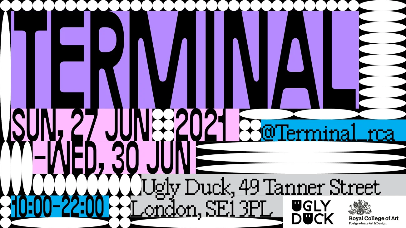

For the neo-nomads amongst us, lobby-room dwellers, coffee-shop inhabitants — creatures of the transient who thrive in flux — the global lockdown created deep inertia. From the strange and transitory now, we are traveling back to when things stopped — "terminus" from Latin.
TERMINAL is not where; it’s when. It unpacks the broader questions when brought on. When everything is unmoving, uncertain, and unprecedented, how do we change, create, and grow? When in isolation energy is a limited resource, what can we afford to create? When art is deemed non-essential, how can sacrifices and compromises inform new values in the work we take into the post-Covid world — what is essential?
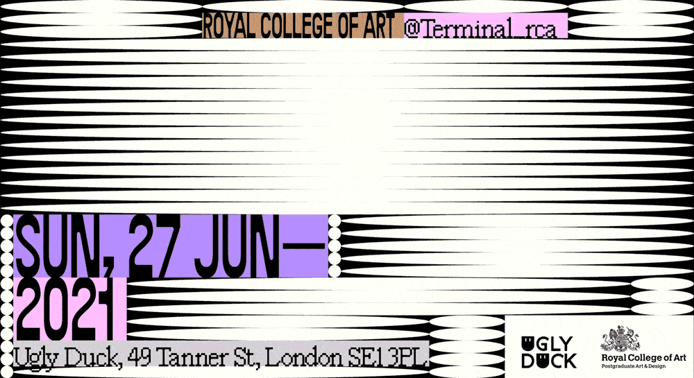
In June 2021, after the second wave of COVID-19, most members of the Visual Communication department of the Royal College of Art couldn’t accept the idea that after two years of MA and COVID, we wouldn’t have had a graduate show to testify our journey. While officially it was still hard to set shows in academia for the risk of going against Covid laws, the university allowed us to self-initiate a student-led, independent one.
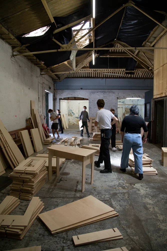
Within a month, we crafted our show from scratch, building our furniture, developing a visual identity, and curating the exhibition space. I was part of the visual design team, where I had the unique chance to work alongside brilliant people and to contribute as a designer and project coordinator.
This experience taught me the beauty and the importance of collaboration between creatives. For almost two years, it had been impossible to meet and work in the same room, making the creative process an extremely solitary one. Being able to sit in the same place and experiment, and build from each other's inputs was a simple reminder of how powerful a creative collective can be.
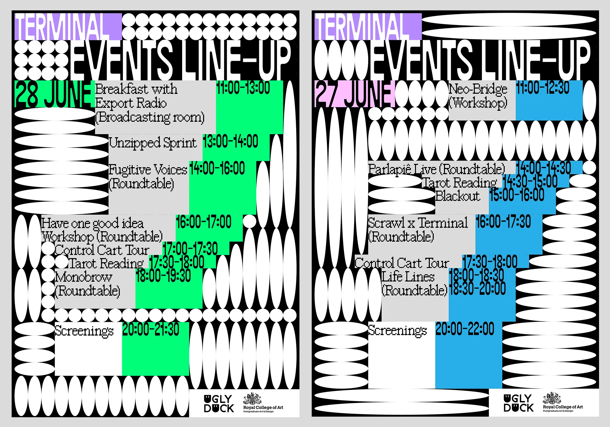
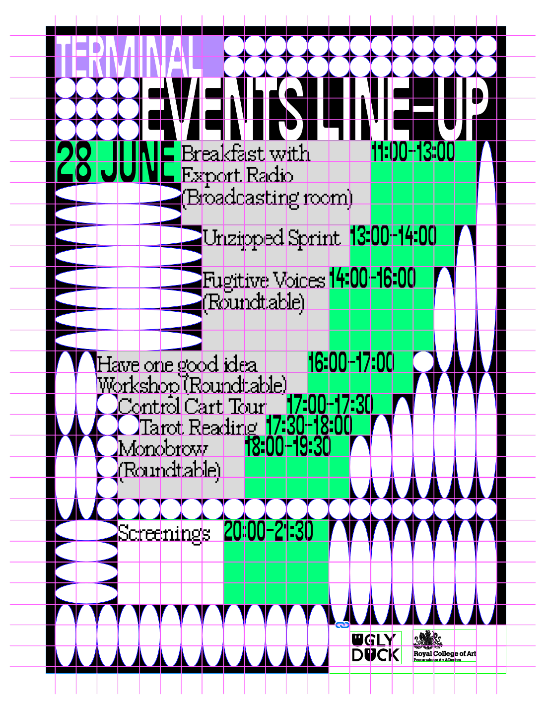
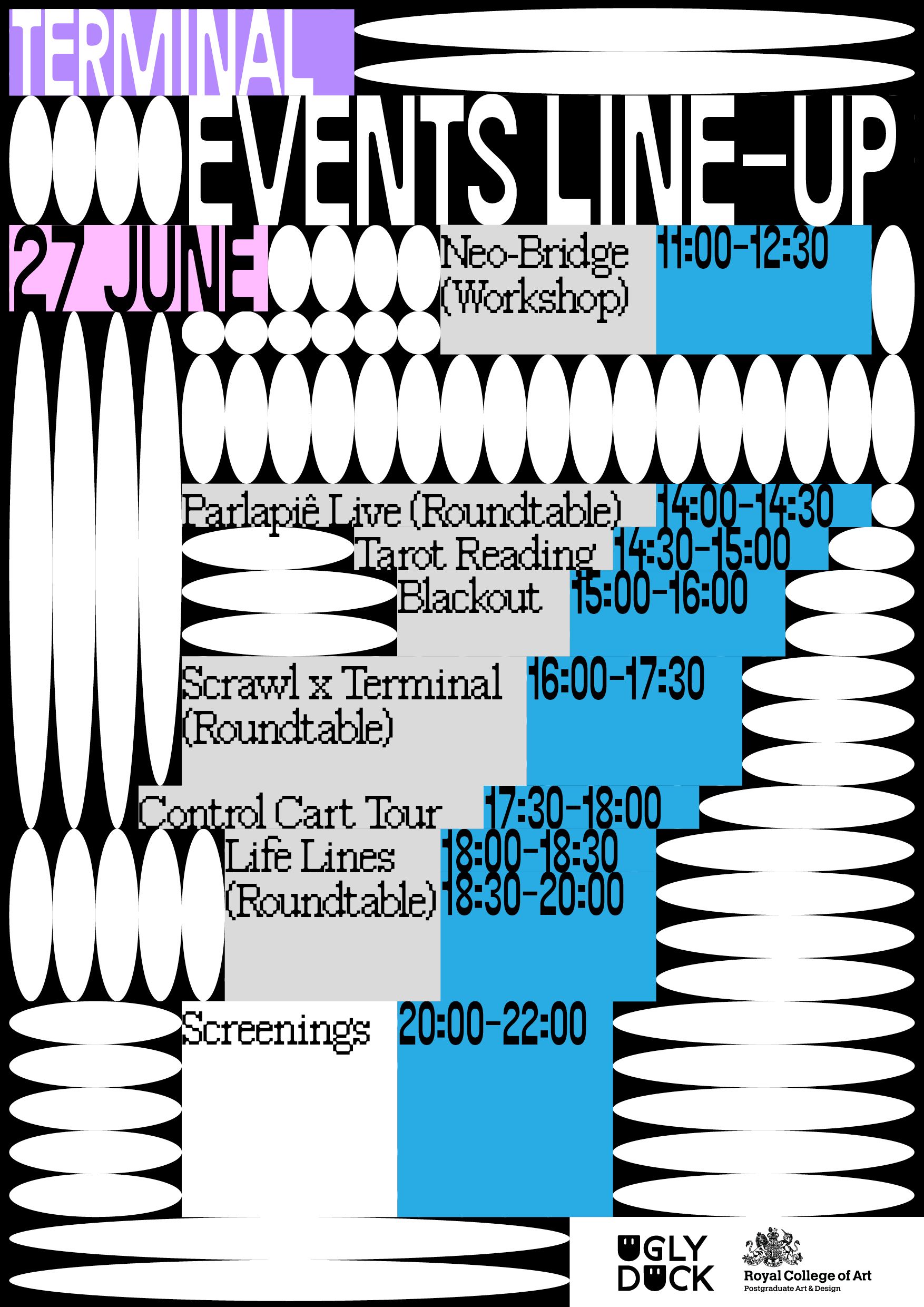
Once found the curatorial concept - terminal, the team started looking into visual representations that could fit the definition. We delved into highly constrained visual systems such as airport boarding screens, modular grids, computer terminal aesthetics, and ASCII art, where the visual outcome is mostly dictated by contextual necessities. Below, among others of the team, are some of my early explorations:
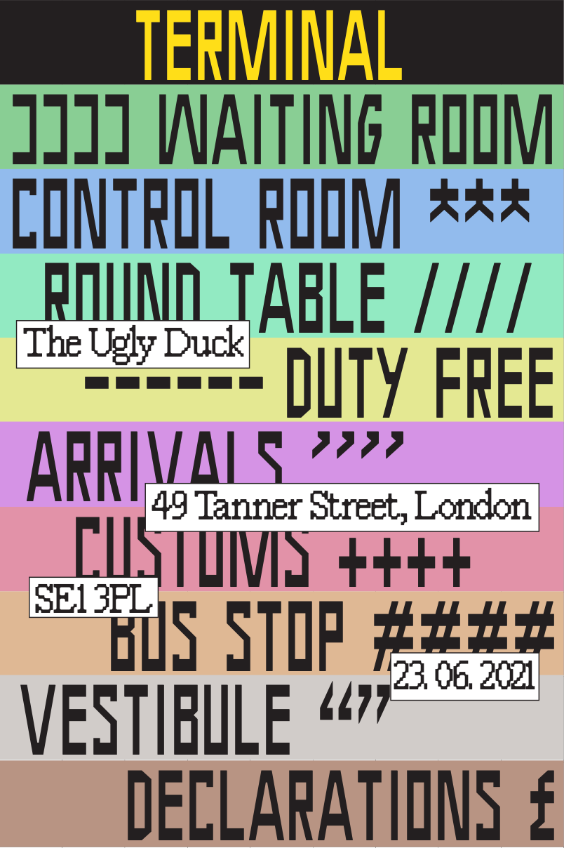
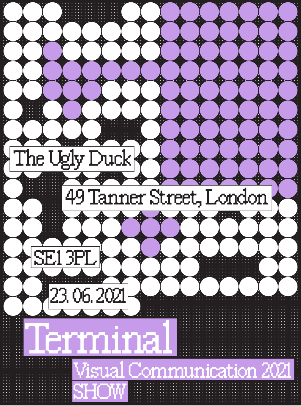
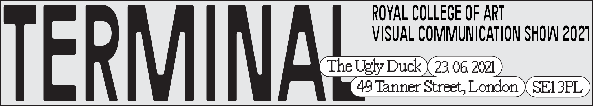
We intended to generate a visual system that would look bold and contemporary while transmitting the roughness and the survival struggle of a terminal environment. After a few tryouts, we finally landed on two typefaces: FK Raster Roman by Florian Karsten, and Tarmac Terminal, by William Jacobson.
Once defined the ingredients of the visual identity such as colors and typefaces, we focused on the behaviors and constraints between the elements of the grid - an essential step to solidify the connection between the concept and the outcome. The system was finally rooted in four principles:
- The canvas must present 21 dots on the shortest side, with the grid made accordingly.
- The canvas is composed of blocks that have no gaps between each other.
- Dots can stretch to fill the maximum space available.
- The height of a font’s caps must correspond to the height of one or more blocks.
Then, we made a reusable Indesign template to let anyone contribute to the visual identity. Here's a breakdown of the final grid:
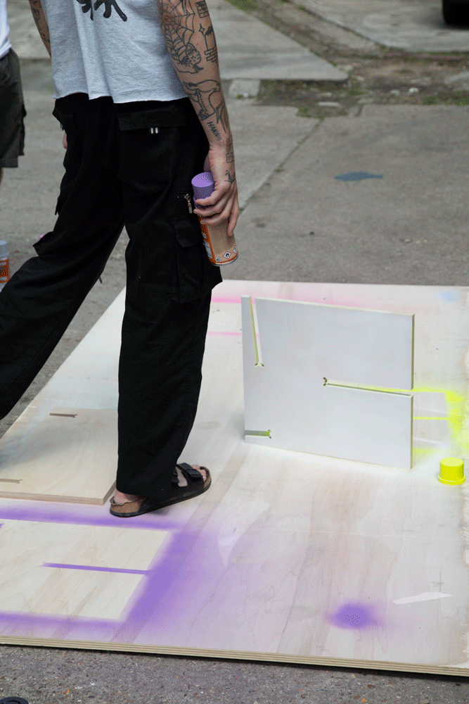
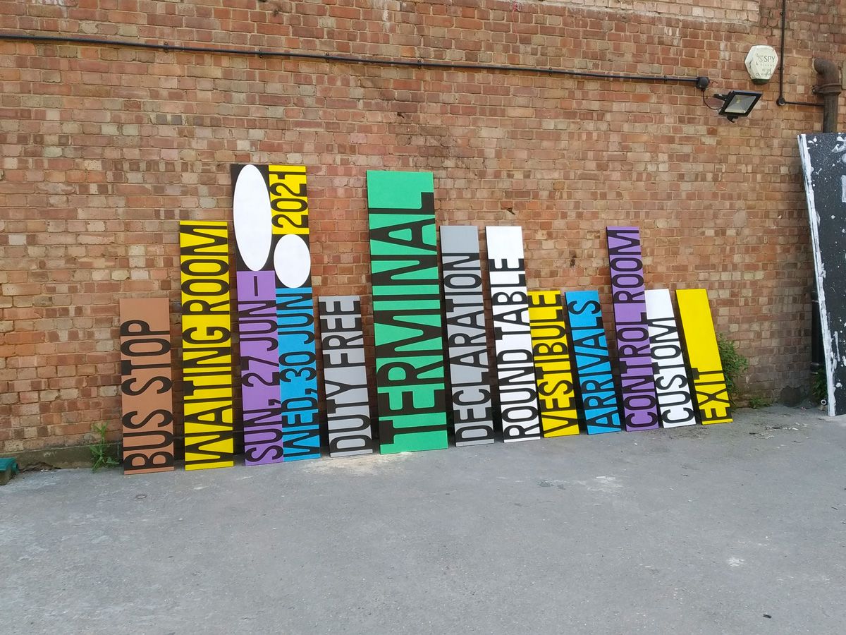
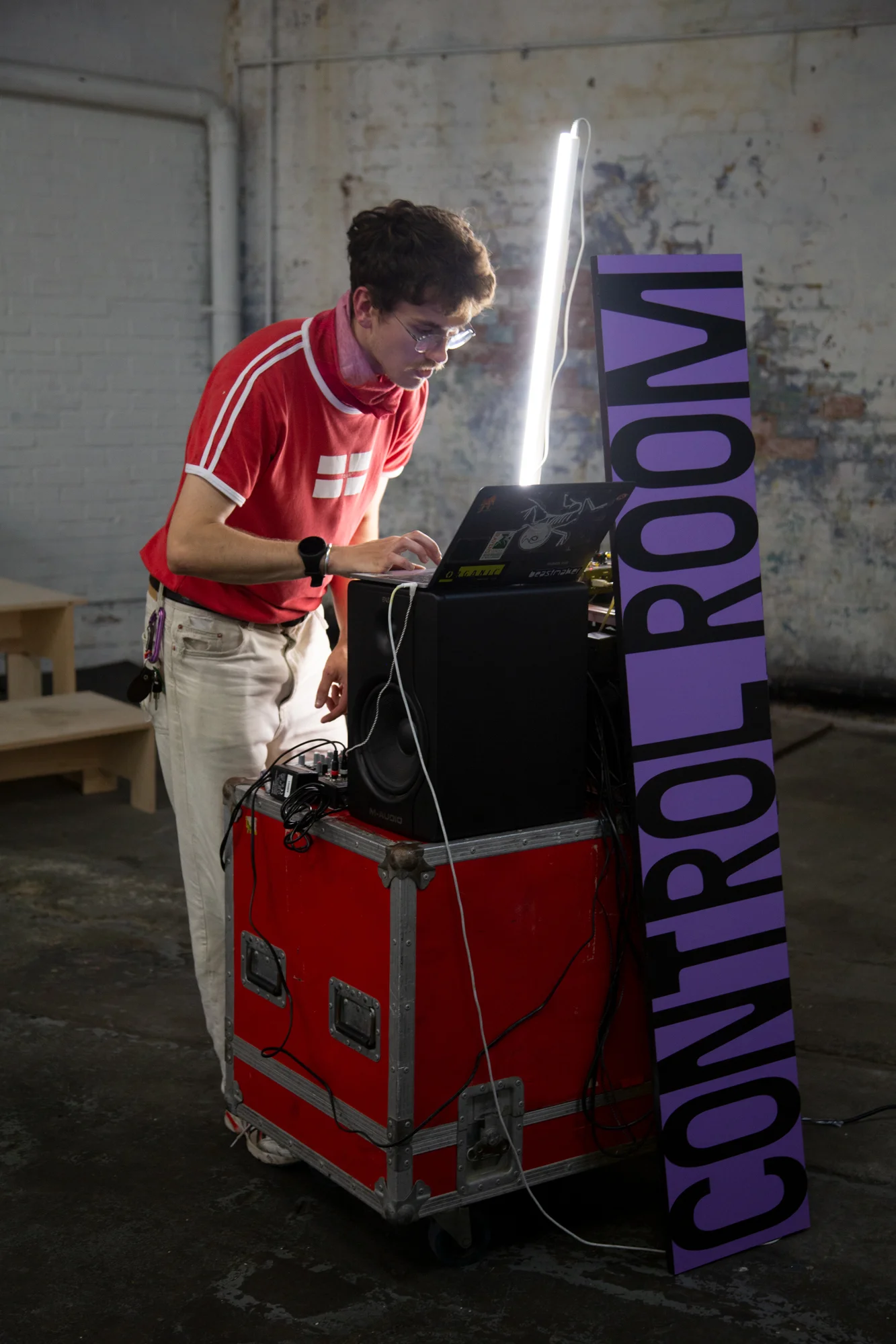
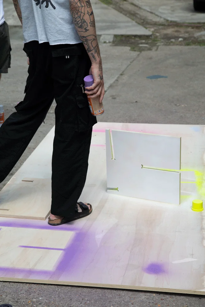
As for the exhibition props, we translated the identity into wooden spray-painted boards, one for each room. Vynil cut was used for the lettering.