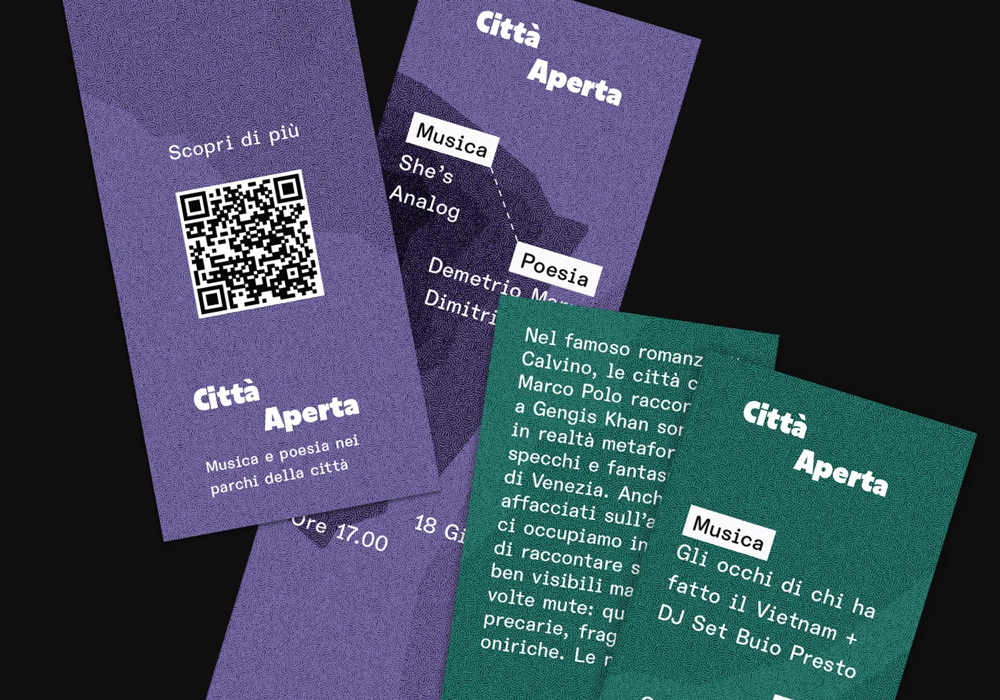
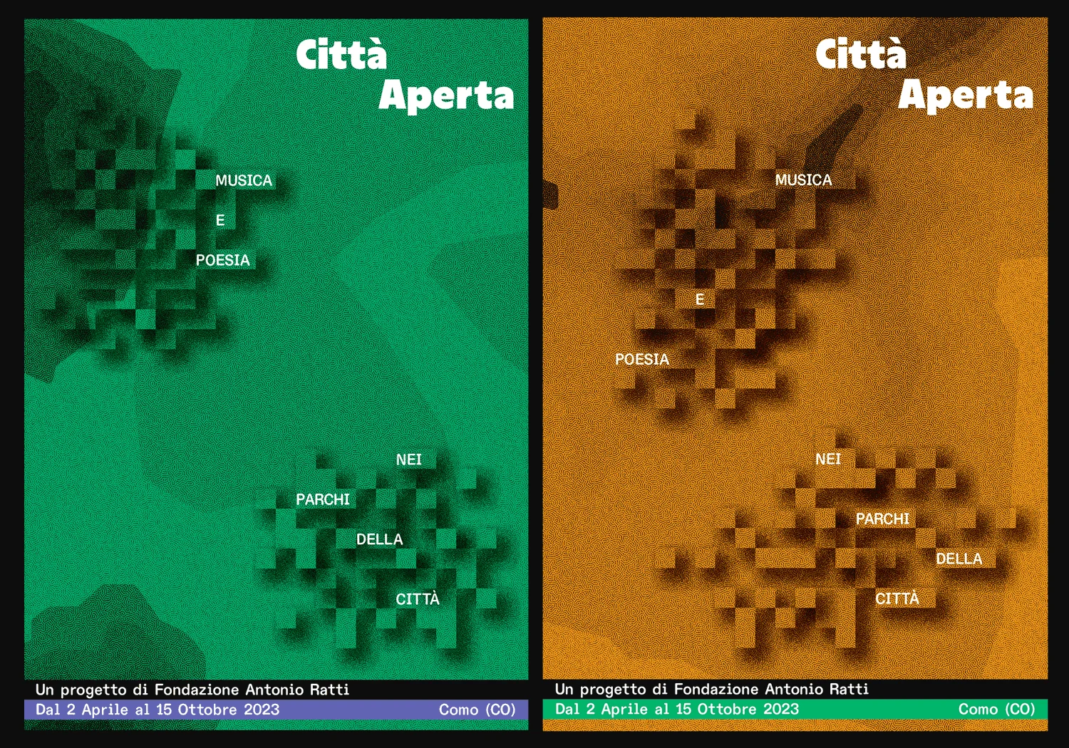
Città Aperta is a series of events at the intersection of music and poetry taking place in Como, hosted and curated by Fondazione Antonio Ratti. For these events, I was commissioned to produce a flexible visual identity to be maintained in-house by the client.
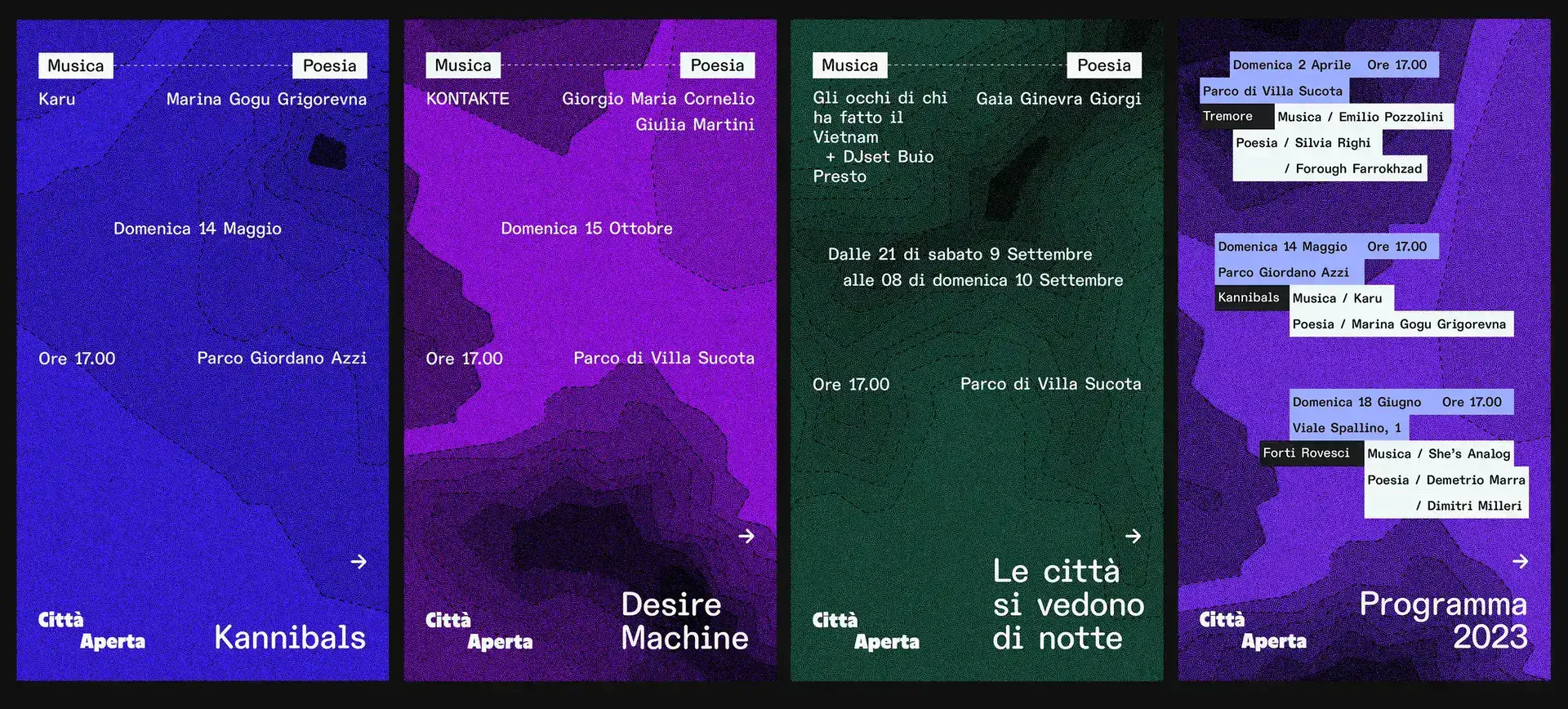
I approached the brief by deconstructing the curatorial concepts into graphical elements, where each event - made by the exchange between poetry and music, is an organic entity that could be self-sufficient, while also being part of a whole. So I looked at the big picture as a landscape and then subdivided it into orbits and blocks. Each orbit would represent an event, and each block, an information. The purpose was to establish a dialogue between those orbits within the landscape of Como.
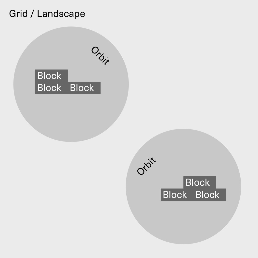
Similarly to another project done previoously, Terminal RCA, one of the objectives here was to design templates that could be used by other people (not necessarily designers), and to achieve this I decided to set a modular grid, which in my opinion would give me a good playground for the client to experiment, without the risk of breaking the visual system.
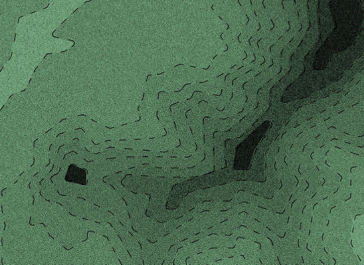
When it comes to images, I was intrigued by the idea of translating visually the tension between music and poetry, and I came across the concept of reaction-diffusion - a natural model in which two substances are transformed into each other while spreading out over a surface in space and describing the emergence of periodic patterns such as spots, stripes, and mazes.
Finally, the choice of the typeface for the visual identity comes from an analysis of the designs used by Fondazione Antonio Ratti in previous exhibitions and projects. Several recent projects were designed or documented using ABC Diatype by Dinamo, and this led me to use a variant of this typeface, ABC Diatype Rounded, which would maintain the same core while offering a less austere look.