Nuxt 3, Sanity, Tailwind CSS
I have met Beatrice thanks to her participation to the 4th edition of Sustarìa festival, an annual event taking place in Lago (Cosenza, Southern Italy) that I am particularly fond of. When we met in Paris to discuss her website, I immediately felt sympathy for her work. I found it funny, poetic and extremely expressive: something that could fit in a stamp as much as it could fit in a wall. The website aims to reflect this character, bold and vintage, fearless of being out of scale.
As soon as I looked at Beatrice's work, I found similarities with an illustrator that I love, that I had the pleasure to discover during my BA thesis project: Pablo Echaurren. In particular, I saw similarities with his drawings for the publishing house Savelli, a leftist editorial project specialised in novels and essays that existed between 1963 and 1982.
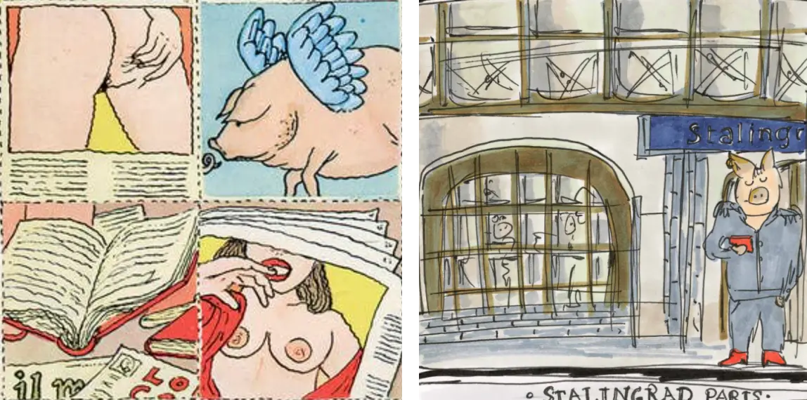
In my view, Beatrice and Pablo had in common an eye for the everyday, and the capacity to depict weirdness and ugliness with empathy, and humor. The use of watercolor and the vivid portraits were also an inspiration for the palette of the website, that mixed highly saturated shades with and soft ones.
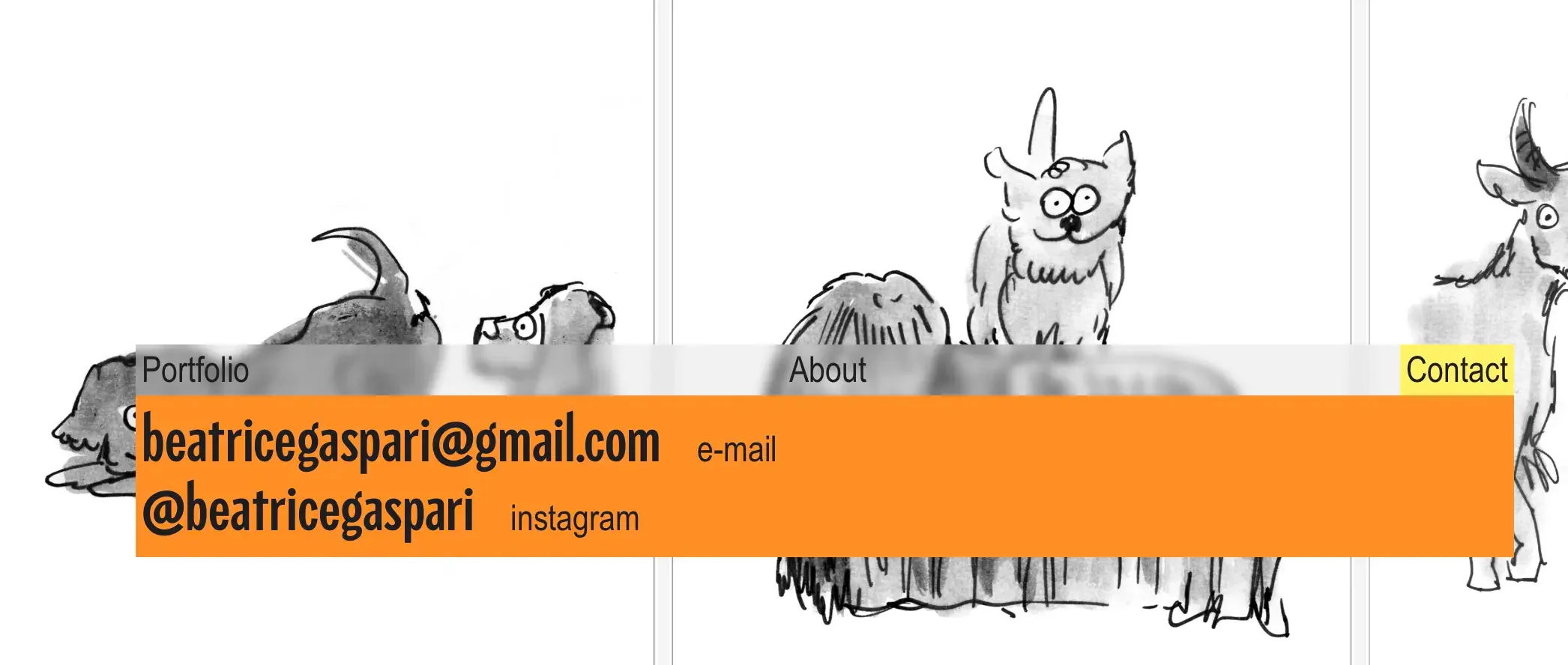
To remain coherent with the general vision, I was looking for a typeface - or a combination of typefaces - that would feel contemporary, editorial and a little irreverent, without the risk of taking away the attention from the main protagonists of the website: the drawings. Among many sans-serif contenders, Arial Narrow was the final pick, in particular due to its modest elegance and its stretchy energy. For the "About" section and the contacts, I decided to add another typeface, Piscolabis, based on hand-painted signs found across Europe and aimed at breaking the precise monotony of Arial.
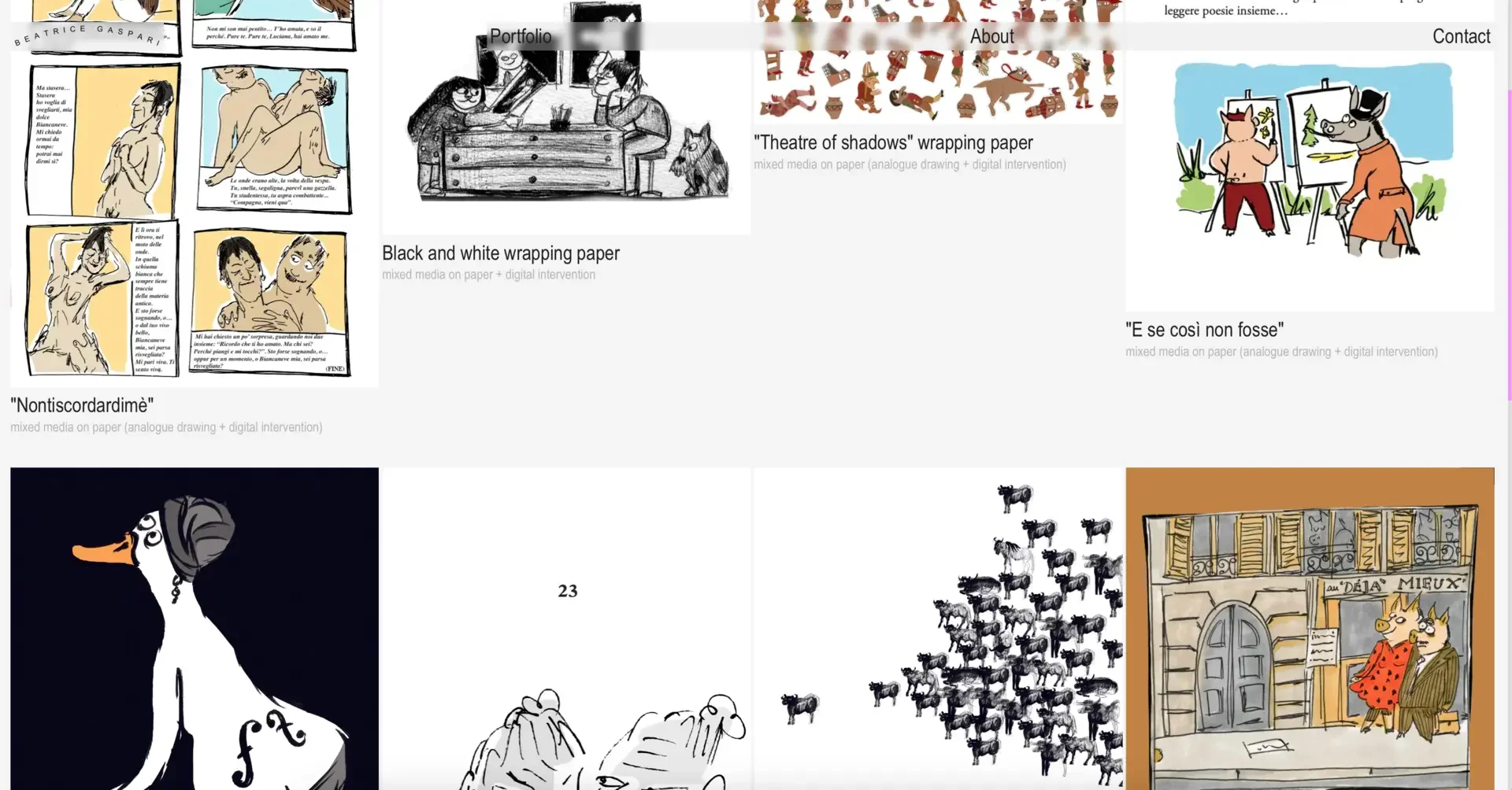
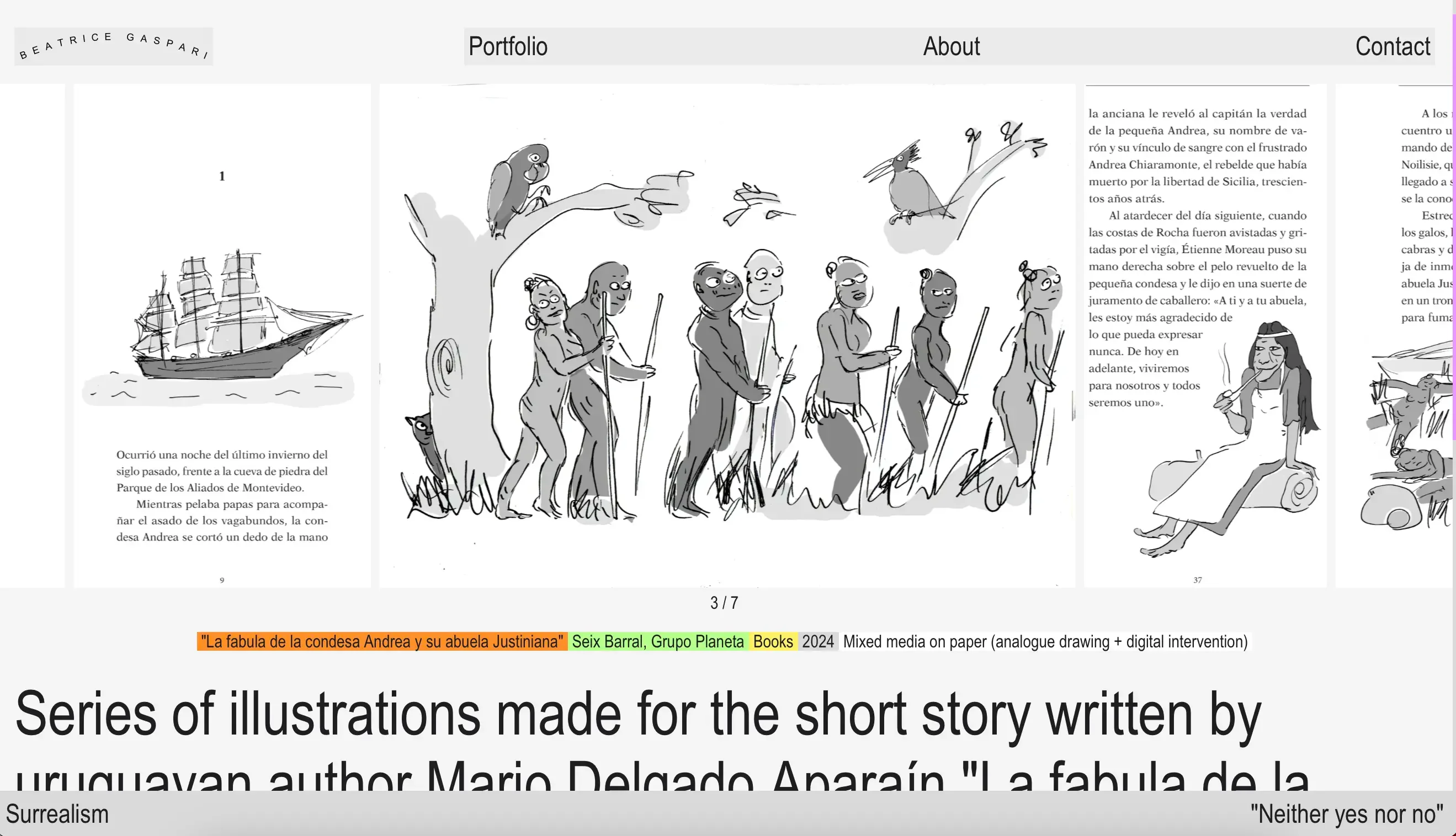
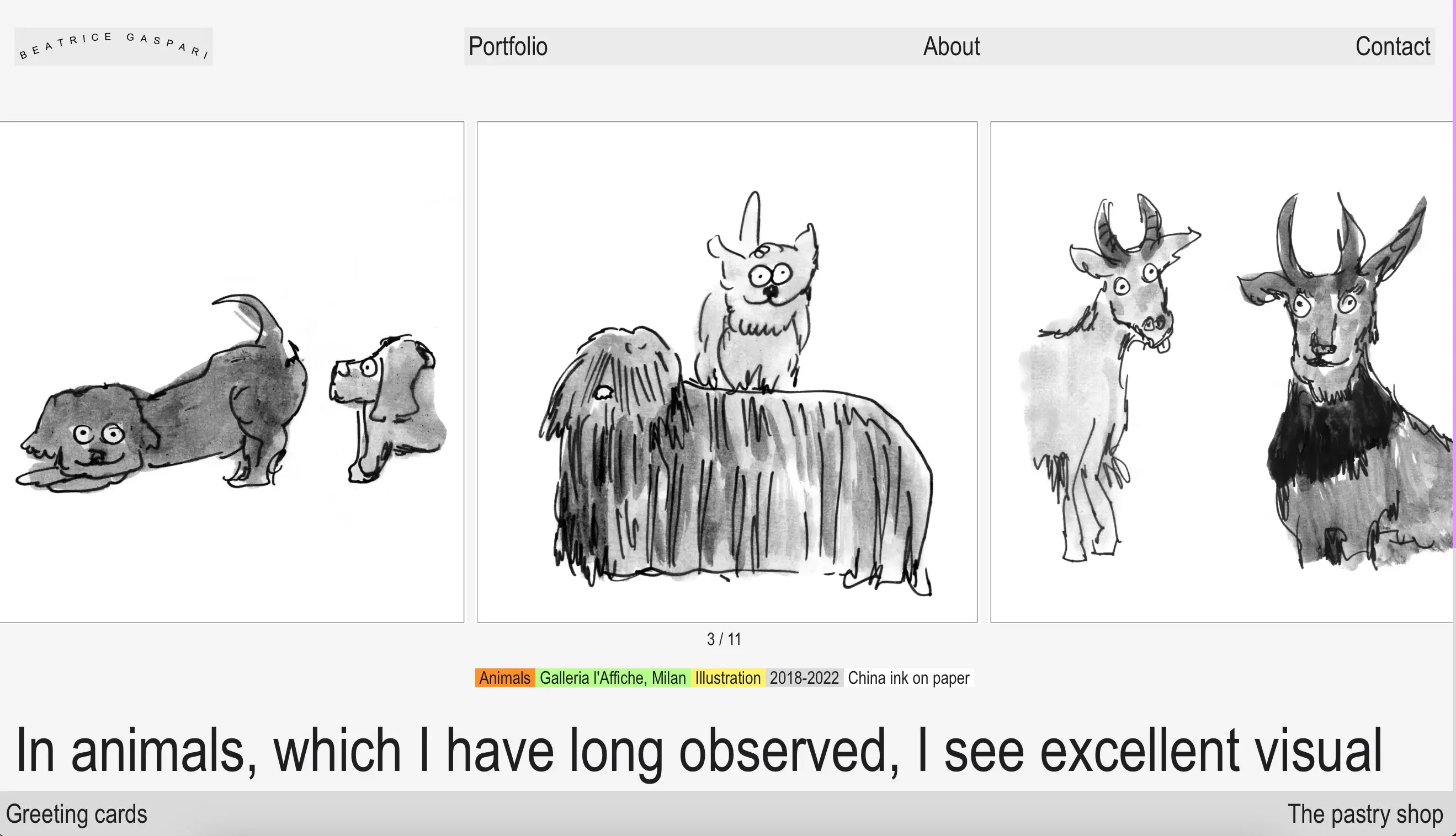
In terms of scale, I decided to alternate oversize text for main body contents, and tiny type for labels and furniture texts, to reinforce the irreverent, nonconformist character of the site.
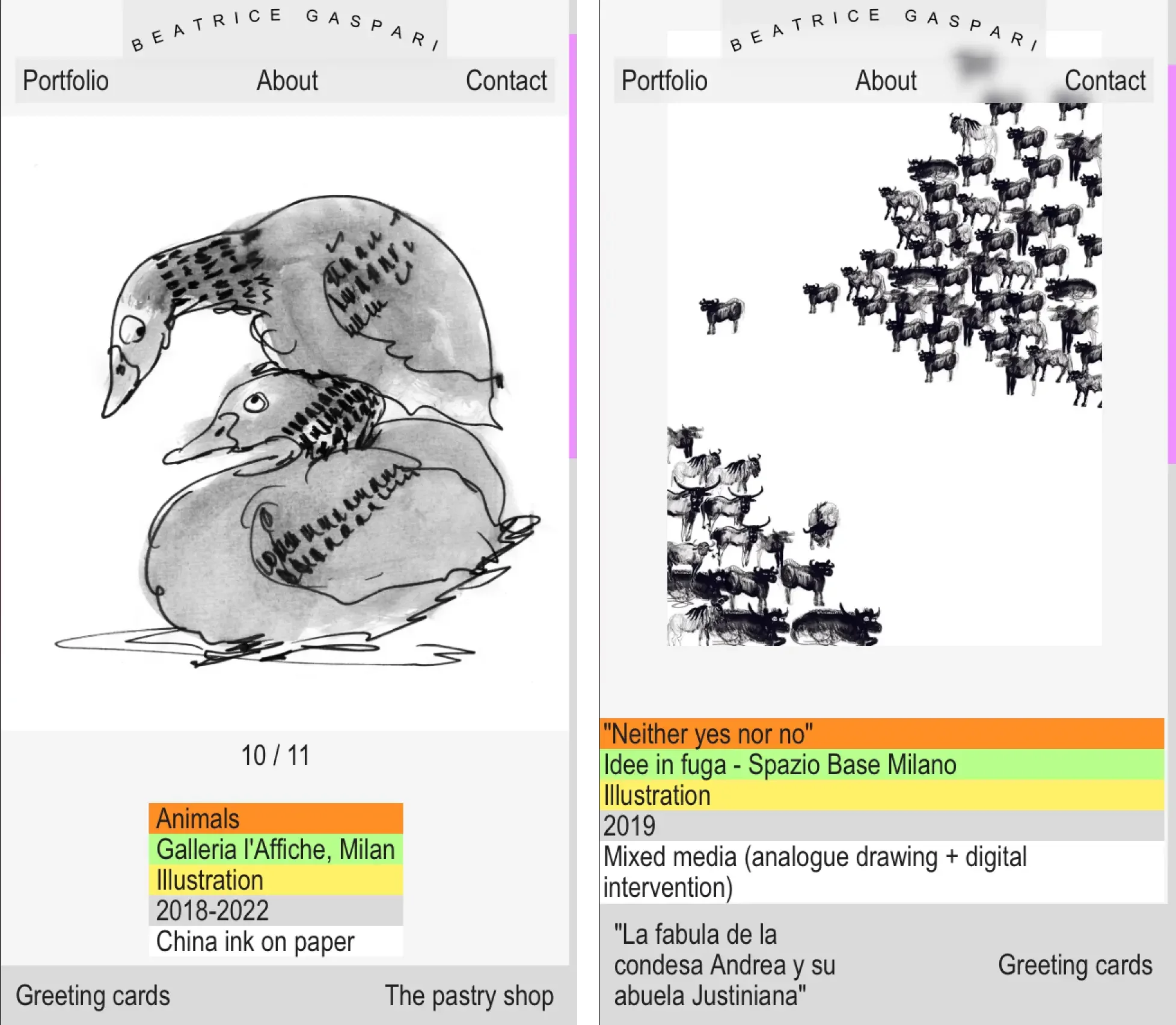
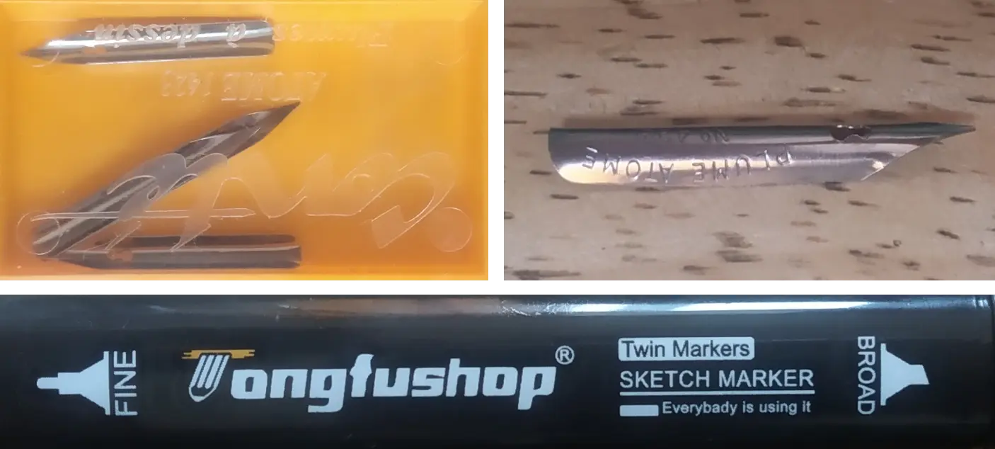
One characteristic of Beatrice's work, is the presence of tiny details in each drawing. Whether it is a shop sign, a book cover, or a small postcard that fell on the street, they contribute to the feeling of familiarity that her work gives you - especially if you happen to live in Paris. I wanted to put on screen this observational attitude, and I tried to connect with it by observing the tools that Beatrice uses for her sketches in her studio.
This website was a great exercise to bring my competences further with the Nuxt 3 / Sanity stack. The tiny scale of the website allowed me to focus on writing optimised and efficient code, with a particular attention on image handling and compression to improve performances. It was also an occasion to reintegrate Tailwind to my stack, and reduce greatly the amount of written css. The website is statically generated on Vercel.
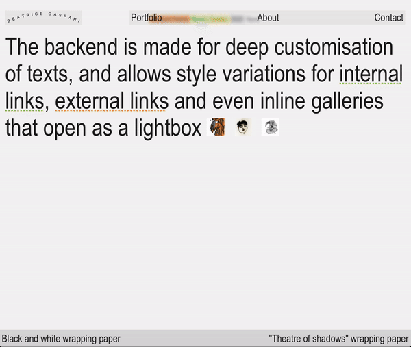
One "hidden" feature of this website is the capacity to offer a custom editorial experience for the client that allows to insert thumbnails and galleries, and to differentiate the aspect of links. All these features were implemented by experimenting a little with Sanity's portable text.